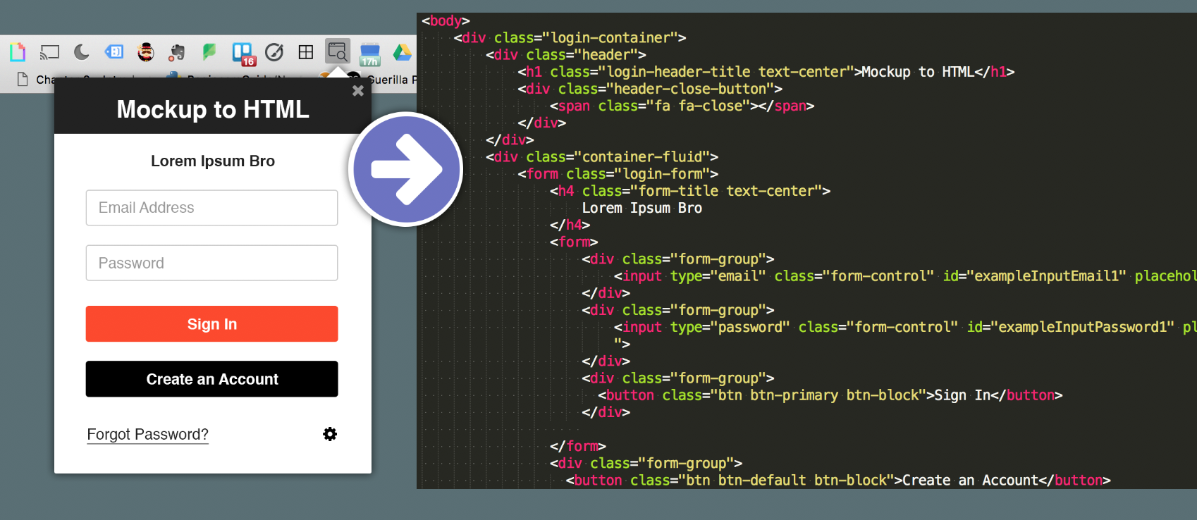
A quick and efficient process to go from mockup to HTML & CSS.
As a frontend developer for over 7 years, I've had the pleasure of working in situations where I had no choice but to build things as fast as possible. Over time I developed a process that allowed me to move quickly from mockup to code, and that process is what I will be sharing in this post. I hope some of what I've learned to speed up my development will be helpful to you.
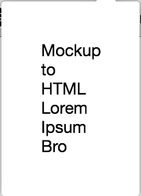
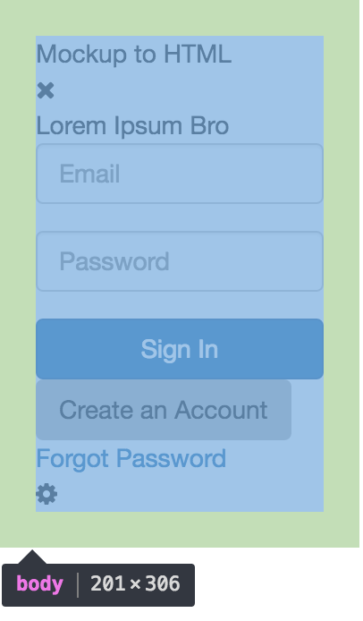
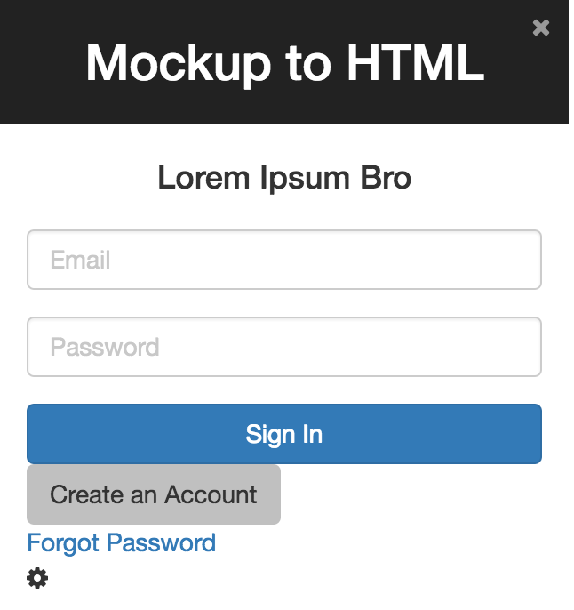
Consider the following layout.
How do you convert a layout like the one above to HTML and CSS quickly and efficiently? Well, continue reading to see how I do it.
1. Create basic HTML 'Containers'
Just by scanning this layout I see that I'm going to need a parent container with header, body, and footer containers. The header will hold a title container and a button container.The body will hold a form container with a title container. The footer will hold a link container and a settings button container.
I'm using the word 'containers' rather than 'elements' on purpose. You don't need to think in terms of specific elements just yet.
Starting from the outside, and working your way in, use simple divs to sketch out the basic page hierarchy.
We will worry about choosing specific span, a, or whatever elements later on in the process, but we don't need to waste thought that right now.
<div class="login-container">
    <div class="header">
        <div class="header-title"></div>
        <div class="header-close-button"></div>
    </div>
    <div class="main">
        <div class="login-form">
            <div class="form-title">
            </div>
        </div>
    </div>
    <div class="footer">
        <div class="forgot-password"></div>
    </div>
    <div class="settings-button"></div>
</div>
At this point I also like to add classes to help me understand the purpose of the divs. You could use HTML comments instead if you prefer to avoid adding unused classes to elements. I like to add classes from the beginning because it saves me time later, even if I don't end up using all of them.
Using a plugin like Emmet for Sublime, the above layout can be quickly generated by typing:
div.login-container>div.header>div.header-title+div.header-close-button^div>div.login-form^div.footer>div.forgot-password+div.settings-button
2. Add Minimal Content
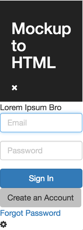
Next, add some minimal content to your containers so you have something to preview in your browser. Without any content all you'll see is a blank page.
<div class="login-container">
    <div class="header">
        <div class="header-title">Mockup to HTML</div>
        <div class="header-close-button"></div>
    </div>
    <div>
        <div class="login-form">
            <div class="form-title">
                Lorem Ipsum Bro
            </div>
        </div>
      </div>
      <div class="footer">
          <div class="forgot-password"></div>
      </div>
      <div class="settings-button"></div>
</div>
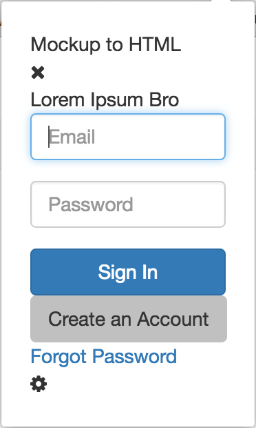
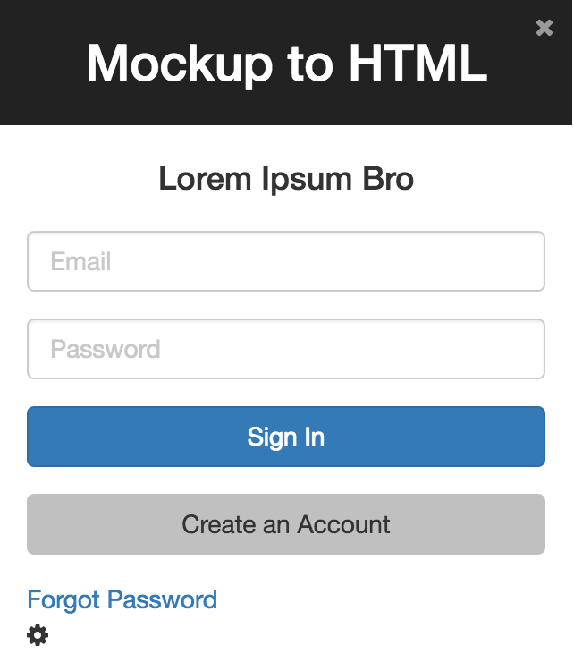
So far my page looks like this:
This project was built for a Chrome extension, rather than a regular browser window, which is why its horizontally squished. Previewing this HTML in your browser may produce different results.
3. Add external CSS, elements, and classes
Now, its time to decide whether you are going to use a UI kit and add any kit related elements or classes.
For this project, I'm using Bootstrap and FontAwesome.
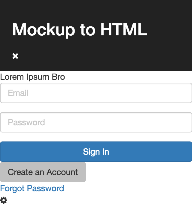
After adding external CSS, elements, and classes, my code looks like this...
<div class="login-container">
    <div class="header">
        <div class="header-title">Mockup to HTML</div>
        <div class="header-close-button">
            <span class="fa fa-close"></span>
        </div>
    </div>
    <div>
        <form class="login-form">
            <div class="form-title">
                Lorem Ipsum Bro
            </div>
            <div class="form-group">
                <input type="email" class="form-control" id="exampleInputEmail1" placeholder="Email">
            </div>
            <div class="form-group">
                <input type="password" class="form-control" id="exampleInputPassword1" placeholder="Password">
            </div>
            <button class="btn btn-primary btn-block">Sign In</button>
        </form>
        <button class="btn btn-detault">Create an Account</button>
    </div>
    <div class="footer">
        <div class="forgot-password">
            <a href="#">Forgot Password</a>
        </div>
        <div class="settings-button">
          <span class="fa fa-cog"></span>
        </div>
    </div>
</div>
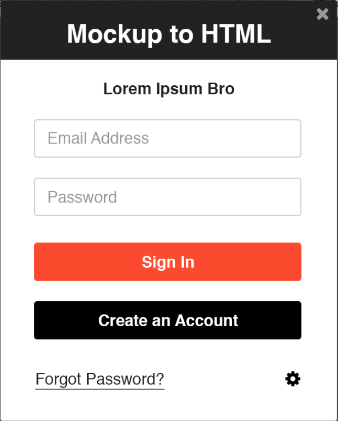
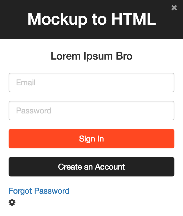
...and my UI looks like this:
Not bad! Now that all of the elements are on the page, we can get into the CSS.
4. Add custom CSS (as needed)
'As needed' is very important here. If you can reuse styles already included in a UI kit like Bootstrap, or default styles that come with elements like h1 or p, do it. (Don't reinvent the form-group!)
Just as I did when adding the initial HTML, I start from the outside and work my way in to identify the elements that need custom CSS applied to make them match the mockup.
Don't worry about being perfect.
My outermost container MIGHT need some styling but I'm not sure just yet, so I'm going to skip it and move on to the first child container, the header.
Mainly, I need my header to have a black(ish) background and stretch the entire width of the top of the window. I'll apply those obvious styles first.
I pretty much always edit my styles using the Chrome Developer Tools. It provides quick visual feedback and makes it easier to identify where you might have conflicting styles.
I can see immediately that I need to remove the padding from the 'body' element if my header is going to fill the full width of the window.
Once that's fixed, I update .header {} to:
.header {
    background: #222;
    color: #fff;
    padding: 15px 20px;
}
To style the header title text, I just changed the header-title div to an h1. Now my UI is looking like this:
Now I'm noticing a big problem with my outermost container: its tool small!
Before continuing to style inner containers, I like to fix problems on the outer containers first.
I update my .login-container class to:
.login-container{
  width: 320px;
}
It's looking much better!
The last thing I need to do to make the title in the header look right is center the text. So, I just add Bootstraps text-center class to the element and it fixes that right up. Awesome! No extra CSS needed!
Now that that's all set, the last thing I need to finish the header layout is move the 'x' button to the top right corner and make it grey. So, I update my header-close-button class to:
.header-close-button{
  position: absolute;
  top: 5px;
  right: 10px;
  color: #999;
}
Hooray! That looks great!
5. Continue adding custom CSS (as needed)
Now that the header of the page is all right, we can move on to the next sibling container. For this project, the next container to dive into is the main container, which holds the form and the form title.
The most obvious things I notice are that we need some space (padding) around the content, and the title needs to be bigger, centered, and have space above and below.
To save myself from writing any new css I used bootstraps container-fluid class to add padding to the content div and the footer, I changed my form-title div to an h4 and added Bootstrap's text-center class.
Looking good and no extra CSS needed!
I notice I need my 'Create an Account' button to be full width. That's an easy fix by adding Bootstraps btn-block class.
Next, I need to make sure the buttons are not sitting right on top of whats below them. I'd like them to have the spacing the those text inputs seems to have.
I inspected the inputs to see where their spacing is coming from, and its coming from Bootstrap's form-group class.
So, all I need to do is wrap my buttons with an element that has the form-group class to give them the same spacing.
That worked like a charm and no extra CSS needed!
Next, I need to make my buttons the right color. I'm currently using Bootstrap's btn-primary and btn-default classes.
I'll just write some new CSS for those classes so they match my style guide. btn-primary will change to my orange, and btn-default will change to my black. (don't forget to update hover states!) My CSS for these looks like:
.btn-primary {
    background-color: #ff4821;
    border-color: #ff4821;
}
.btn-primary:hover {
    background-color: #ff5635;
    border-color: #ff5635;
}
.btn-default {
    color:#fff;
    background-color: #222;
    border-color: #222;
}
.btn-default:hover {
    color:#fff;
    background-color: #333;
    border-color: #333;
}
Its looking beautiful!
Now for the final bit, the footer.
My link needs to be black and underlined. My cog needs to float on over to the right.
To update the style of my link, I updated the global styling for all links to:
a{
  color:#000;
  text-decoration: underline;
}

a:hover{
  color:#666;
}
Finally I added Bootstrap's pull-left class to the forgot-password div and the pull-right class to the settings-button div.
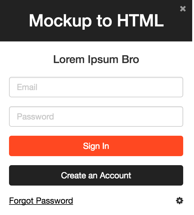
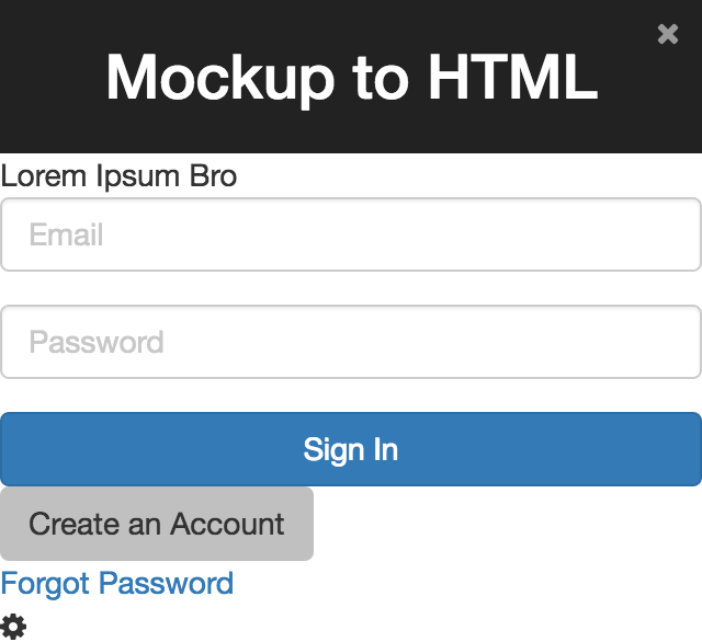
All done!
While it doesn't look EXACLTY like my mockup, it's close enough to meet the needs of my project.
If you need it to be exact, you'll need to get the exact spec from your designer (or photoshop) and update your font-size, padding, etc. accordingly.
I hope that by sharing my process for how I go from mockup to code quickly and efficiently, you've picked up a few tips that can help you improve your process. If you have any tricks of your own that improve your development speed, please share in a comment below! Thanks!
About Author: Cassandra Wilcox

Cassandra Wilcox is a full-stack JavaScript developer, Cofounder at Code Hangar Inc., Instructor at Girls Who Code, JavaScript Instructor at Skillcrush, and Organizer of Orlando LadyDevs